If you haven’t seen the previous two parts of this project, start here, but if you’re up to speed, let’s continue.
Typography brings a lot of character, presence, energy, and feeling to a brand. Once you’ve started to flesh out the logo and define what it stands for, it becomes essential to ensure the typography matches that identity. This is not always an easy task, given the sheer number of fonts available.
The Typography Vibe
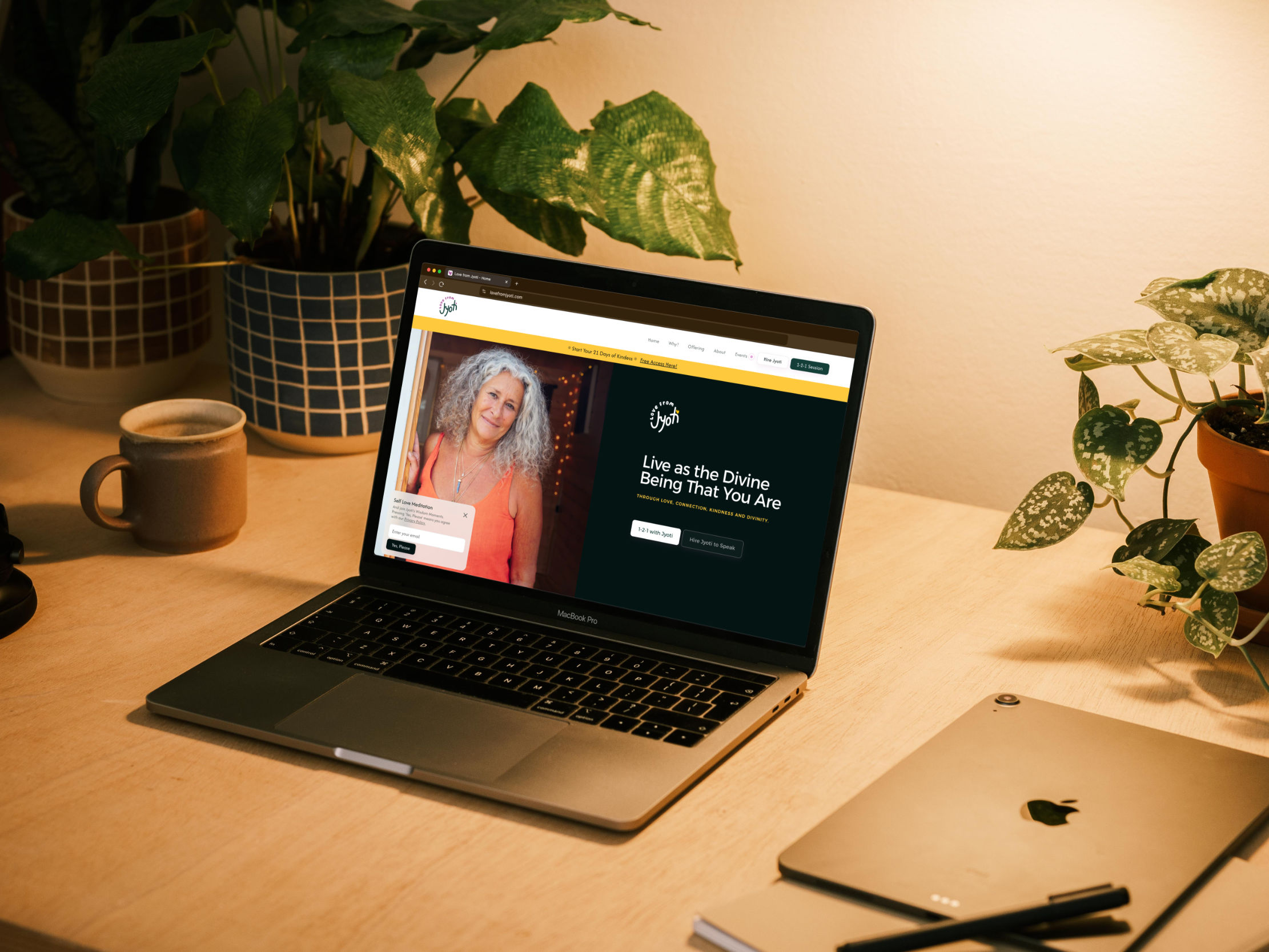
When we started working on this, we explored a few different typography variants. Since we were still experimenting with several logo versions, it was important to sit with different options before settling on the final choice. Once we found the right one, it was immediately clear that it fit perfectly with the shapes of the logo and captured the peaceful essence we were aiming for.
Another key consideration was that we needed to use a free font. There are plenty of free resources online that are accessible for commercial use, but this did narrow down our options. While there’s always the possibility of expanding to a paid font in the future, this project was being created from scratch, so we needed to keep costs low without sacrificing the desired effect and feeling.
Legibility & Staying True
We began by focusing on the heading typography, as this would have the most presence on the page and would often be seen alongside the logo and photography. Once the heading font was chosen, we had the option to either use it throughout the site or introduce a secondary font for body copy. In this case, we decided to use a secondary font specifically for longer text sections.
The reason for this was legibility. In areas such as Jyoti's biography or about section, we needed a font that was readable and legible even at smaller sizes. As beautiful as the title font was, it wasn’t the most legible at smaller sizes due to its uniform structure and roundness. This created some issues when used for body text. Given the context of this project, we wanted to avoid increasing cognitive load or causing any friction for readers, especially since our goal is to serve and support people who require it.
There are many factors to consider beyond just aesthetics. We had to think about the audience, the meaning behind the brand, legibility, and accessibility. All of these are crucial when choosing the right typography. It’s similar to selecting colours or the logo form. When you find the right one, or something very close, there’s a response not just in your mind but in your body, signalling that you’re in the right territory.
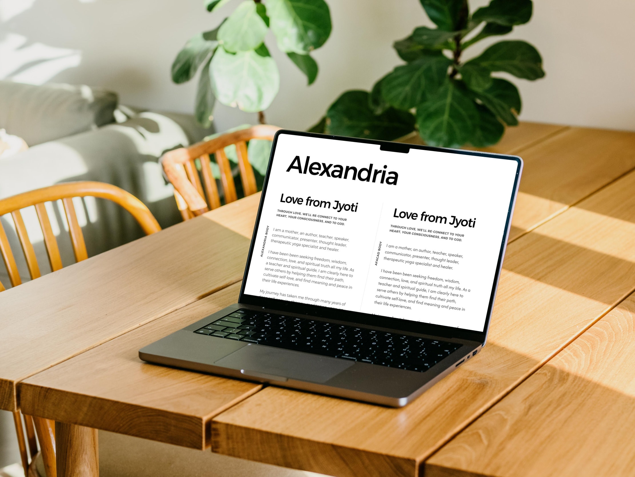
Show Them In Context
Once we reached that point, it was important to share these font choices with the client and show them in context. We created a small digital canvas that included the logo, its secondary variations, elements of the colour palette, and showcased both a title and some body copy. This helped demonstrate how the fonts worked together and complemented the language used in the brand.
At each stage of this process, we introduced the next element and started to present everything in context, making the brand feel more real even before it officially launched. This approach is a key part of effective brand collaboration.
In the next stage, we’ll dive into the design and development of the website, which is where things get even more exciting.