Previously
The output from this initial ideation stage was a slideshow capturing the essence and feelings the brand aims to deliver. This included carefully chosen stock imagery to help convey those emotions. We also shared this with the photographer, who was preparing for a personal branding photo shoot for Jyoti. This gave us a solid starting point to begin drawing and producing the logo, typeface, colours, and the overall essence of the branding kit.
Napkin Drawings
With all projects, there is usually an evident starting point in the development process. Whether it’s sketching on an iPad, drawing on paper, or even scribbling on the back of a napkin at a restaurant, there’s always a clear way to begin. For this project, it started with initial doodles in a small pocket notebook. Once we had a rough concept, we moved on to digitizing it using Procreate on the iPad.
This is always a fun and exciting part of the project. The creativity feels especially alive at this stage. Of course, creativity continues throughout the branding process, even during ongoing development and support, but this moment is special because we are creating something from literally nothing. It’s a valuable and exciting process for me personally.
Stop Forcing Time
What I like to do is spread this work out over several days. There are moments during sleep, while riding your bike, or just going about your day when you get sudden insights that help shape what you’re trying to produce. We try to avoid forcing the process by sitting in a room for hours until something appears. Instead, this initial doodling phase spans many days to allow for a more effective and truthful depiction of the vision.
It’s a beautiful process because you can’t really put a timeline on it. Sometimes inspiration comes quickly, and other times it takes longer. The key is to let the pen flow without fixed rules, expectations, or ideals. Once we have a handful of sketches heading in the right direction, even if they’re not finalized, we sent them over to Jyoti to gauge her response. At the end of the day, we’re creating a brand for someone else, not for ourselves. The client needs to be involved, appreciated, honoured, heard, and integrated in a way that yields great results.
We don’t show every sketch, only the ones that are clearly moving in an effective direction and are close to our collective vision. We are selective in what we present, showing the most truthful options and involving the client at this stage. This approach isn’t about hiding anything or lacking transparency. It’s purely about ensuring the quality and authenticity of the final result. We’re hired to help steer, direct, and form the most accurate representation of what the client desires, so we set some loose boundaries for the greater good of the project.
Vectorizing The Doodles
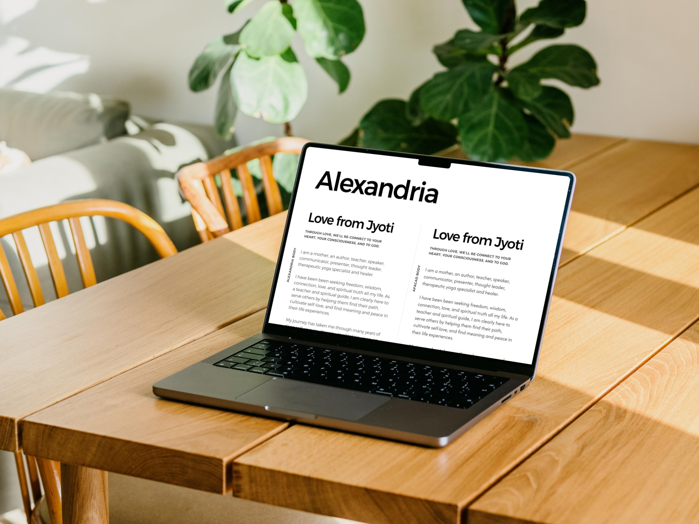
Once some drawings started to generate excitement and energy, we brought them into Affinity Designer to vectorize them. This step brings the designs even closer to the final result. At this stage, we like to create mock-ups, even though the logo isn’t finalized yet. Mock-ups help the client visualize what the logo will look like in real-life scenarios. As designers, we can imagine this easily, but not everyone can picture a logo in different contexts.
Mockups Are Essential
For example, we mocked up the initial vector logos for Instagram, since Jyoti already had a starting user base there. Since it’s a personal brand, her photo would be more appropriate, but it was a useful exercise to help her see how the logo might look on that platform. The logo’s main uses would be on the website, as a watermark, and in places where an image wouldn’t be suitable.
Colours Evoke Emotions
At this stage, it’s also helpful to show various versions of the logo in different colour waves. By colour waves, I mean different variants that could potentially work for the project. This is a great way to start the conversation about colours. Colours can evoke a wide range of feelings, emotions, and thoughts. While there are general patterns in how colours affect people, everyone also has their own unique response. We considered the psychology and energy of the colours, alongside the Love from Jyoti name and the photography we anticipated receiving from the shoot.
Don't Get Fixated
We were able to present a few colour waves and narrow down the options. The next step was fine-tuning the exact hue, saturation, and lightness of each chosen colour. This is an interesting process because at each stage, we try not to lock anything in too early. As mentioned in the previous article, this brand was created from scratch. It wasn’t a rebranding or a business with an existing plan. There was nothing to start with, so it’s always best not to get too fixated on any one element until you can see how all the pieces work together.
This brings us to the next part of the process: typography.