Don’t Discriminate People
An interesting topic actually to talk about is the accessibility of design and producing products that don’t discriminate from people.
It’s quite beautiful actually in the world. More and more companies now are becoming aware of this and the greatness that it brings and the empowerment that it brings to the individuals that really need this. And it’s quite a shocking statistic about the percentage that do have visibility issues, for example.
So just think how true and beautiful that is that you are making the ‘them’ feel valued in the product that you are delivering.
https://www.who.int/en/news-room/fact-sheets/detail/blindness-and-visual-impairment
Why Accessibility Matters: The Foundation of Good Design
Accessibility isn’t just a checkbox—it’s the heart of creating products that include everyone. Here’s why it’s non-negotiable.
And we’ll talk about a specific example here. So there was a business from the UK in the car washing space, mobile car washing. And I received their first version of their mobile application. And yes, functionally it worked. You got from A to B. But it’s not just from A to B because people can drop off that path at any given time if you’ve not factored in a lot of the key steps that are needed to create a successful path and conversion. And some of this does relate to psychology.
Just think about if you are somebody with, for instance, visibility needs that require a specific contrast ratio, a specific way that two colours look next to each other, and this product that you’ve been marketed into to believe that it’s going to benefit your life, sometimes that is true. But when you’re within the product, you lose that sense of value. You lose that sense of appreciation. You lose that sense that it feels like it’s something for you, you as the individual experiencing that product.
We do live in the digital age, a very separated life. So, yes, we have millions of accounts on social media platforms. When was the last time you sat with a group of people and looked on one feed together? It’s a very rare scenario. An experience in a digital product is very one-on-one. And you want to feel that connection. You want to feel that trust and acceptance of you in that. And there’s numerous, numerous ways that you can achieve that.
Fixing the App’s Colour Palette
Let’s dive into the real-world mess- a mobile app redesign that needed a major accessibility overhaul.
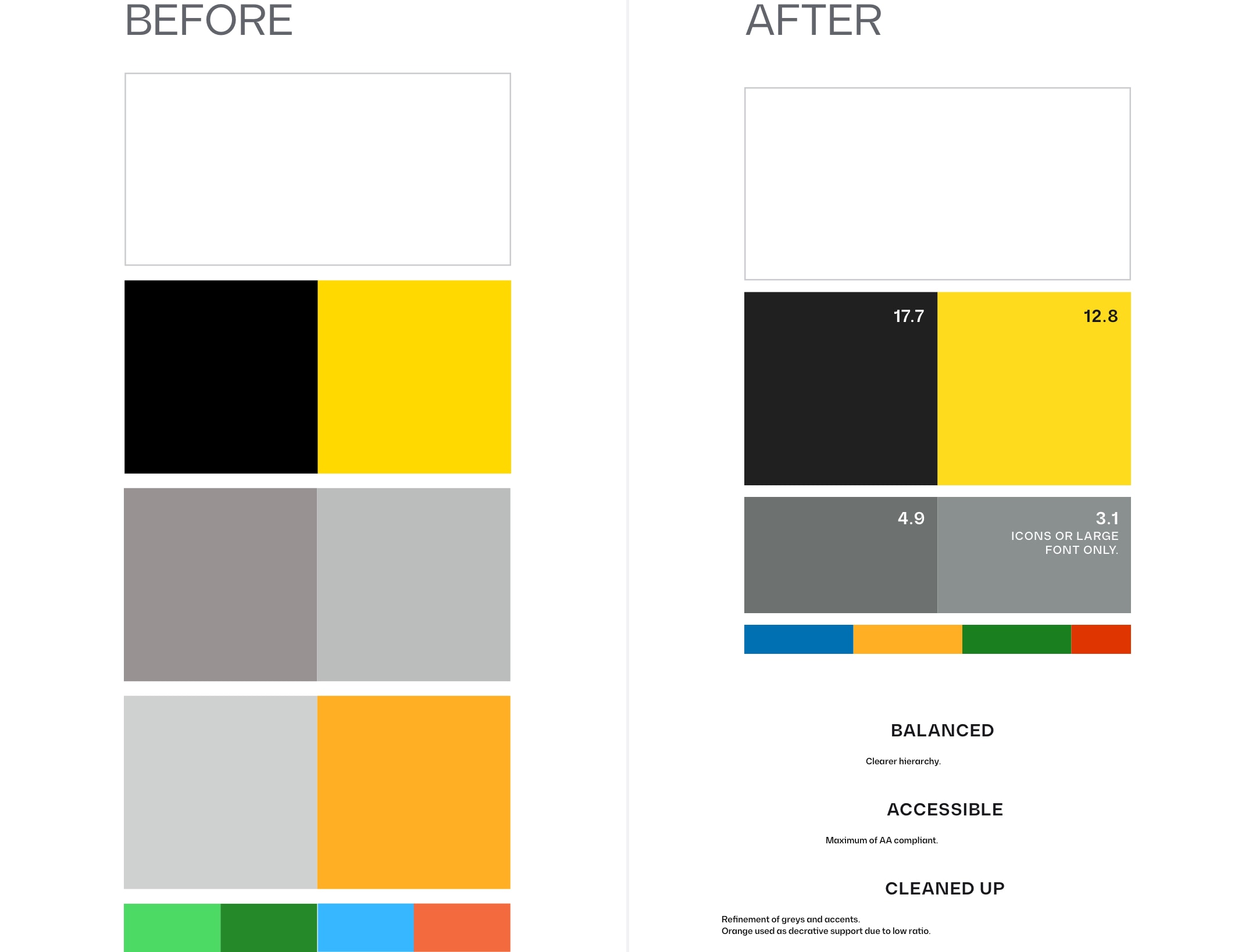
So this was a key highlight from this project that I worked on. And absolutely we needed to redefine the palette. But at times you might be thinking, ‘Yeah, but this is my brand colour, and people know me because of this, this, this, this, this.’ Okay, but the accompanying colours to be in harmony. And what I mean by in harmony is, yeah, they look visually great together, the perception of that. Also, they need to apply certain standards. Because like I said, we’re talking about the digital space here. People that are looking from their eye into this digital screen, we have to factor in that not everyone has the same eye. And like I said, there’s a big, big number of people that really do require the extra assistance in the visual front.
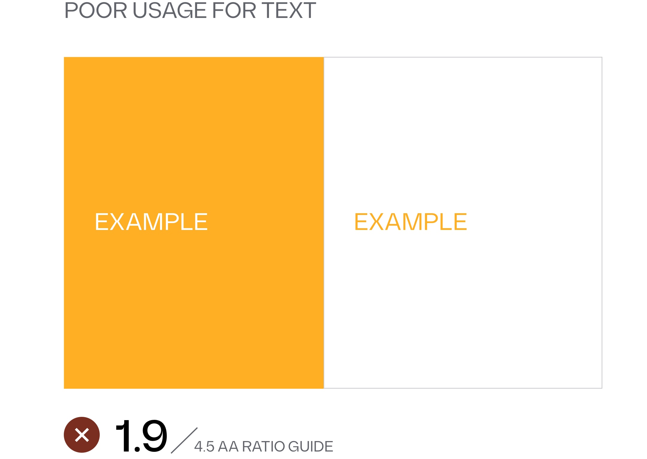
So it’s the contrast ratio that’s quite key. And those contrast ratios being in relation to the font size. It’s a different ballgame to print. We’re not going to go there right now. But there’s some thoughts on that, I must say. And in this product, we kept the exact brand colour. But we utilised some of the other colours in a different way, and a different proportion on the overall product. That can be a big difference as well. The greys, they needed to be increased in their clarity, in their contrast, especially given the smaller sizes that secondary and smaller kind of accompanying text tends to be on a digital product. And this also meant that we had to redefine how a particular colour was being used.
In the original designs that we received, there was this more orange tone. Just imagine quite a bright orange or a bright yellow, and you put white on it. White. Think about how the separation of those colours is lacking. There is no separation. And there was elements within the original design that had these orange, slightly orange tones being used. So we had to redefine how that was being used. We could not ship this next version.
And after which, when you collectively look at all the screens together, they feel harmonious. The ratios apply. We’re inclusive. And as a result, it’s one less piece, one less point that a user could drop off from not feeling trustworthy or valued in the process of that conversion or sale.
https://www.w3.org/WAI/WCAG21/Understanding/contrast-minimum.html
Touch Targets- The Invisible Magic
Tiny buttons, big problems- here’s why touch targets are critical for inclusive design, especially in mobile apps.
Expanding beyond color, because it’s a big facet, of course. It’s what we are seeing, the sense of seeing. But we have the sense of touch in the digital realm as well, especially with mobile devices, physical products that control an interface. And if we talk specifically about mobile, we are using our fingers, the thumb, index. Well, I mean, maybe someone uses their pinky.
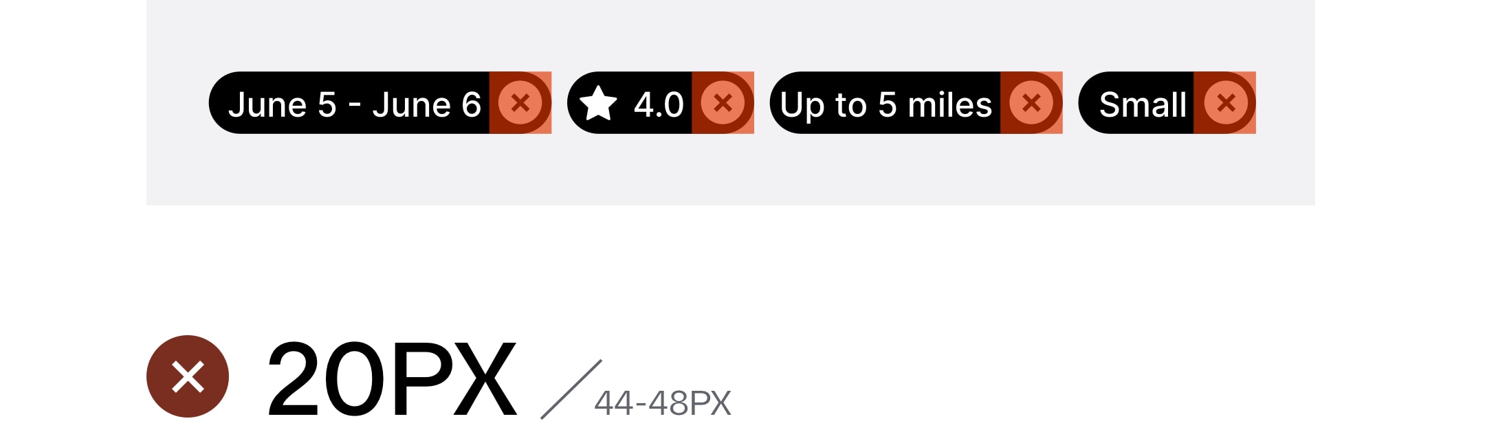
If you look at your hand right now, think about the surface area that is actually interacting with the screen. And then think about the elements that are on the screen of said application, whether it’s a card that you’re swiping through, whether it’s through a button, a link, or tabs, if you can imagine. Sometimes there’s many apps that I’ve received before to improve, or there’s apps that I’ve personally reviewed, and it’s straight off the bat. You know that the usability is going to be terrible because there’s no consideration of the touch targets. And this is a key part of the accessibility.
There’s specific standards that both major platforms—when I say major, I mean Apple and Google, because who knows what the future may hold and the next OS that comes out. But let’s just talk about those two for now. They have a standard. They have a regulation. They’re very close between one another. You know, we’re talking about a few pixels difference between the two. But they have a standard that increases that region that is tappable. The piece that you can tap on the screen.
There might be an icon that is smaller, okay, actually smaller than what it looks like if you were to place your thumb next to it, but actually, the boundary of the icon is larger, and this then facilitates a beautiful experience for the user to tap in that region.
The reason I’m telling you all of this is because, again, this product that came into us to be ready for its next stage of its evolution, because that’s all that we’re ever doing really. We’re always evolving, evolving ourselves personally in the business world and the products that we create. It’s always an evolution. It’s always a learning, journey of learning. And in this piece, there were multiple areas that the touch target, the touch region, the interact-able part was just too small, really too small. And, again, think about, okay, so I said that there’s many steps to achieve that end result that you want. That conversion, somebody making that booking, getting their car washed, okay.
Two of these, these are quite easy things. Actually, being really honest, they’re easy things to get right. Get the colour contrast right. Make sure the touch regions are accessible. That’s two things you’ve eliminated from the chance of you not getting a good conversion. So accessibility matters, okay.
Evolving Design: Let’s Make It Inclusive Together
This isn’t just about one app- it’s a call to evolve how we design for everyone. Here’s how you can start.
It should not be an afterthought.
It should not be a low priority.
It’s almost the foundational part of a product that you create.
And time and time again, we see stuff come in. It was not part of their blueprint. It was not part of their process from the get-go.
Re-establishing the blueprint of creating a digital product in 2025. That’s what it is. Redefining your blueprint. Evolving.
If you’re looking or being called to, make your product more inclusive or create a product and you’re ready to start that blueprint and make people feel accepted in your product, then let’s talk. And we can discuss what it is that you want to bring forward. Let’s make it happen.
Thank you for listening to the spiel. I hope you enjoyed. And even if right now nothing has landed for you, these things can take time to marinate. How we’re so programmed to follow what we know and not travel into the unknown and then drop in the comments what arose after those few days, after you’ve taken a sleep, after you’ve taken a nap, after you’ve taken a walk. Something might slip into your mind.
Lots of love to all. Hold the focus.